
Android's getting a major visual overhaul - here's what's coming
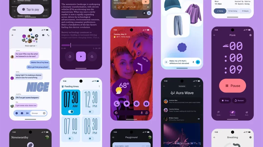
Material 3 Expressive is a bolder take on the same aesthetic, featuring "springy" animations, brighter colors, and new shapes.
After an accidental sneak peek last week, Google has now formally announced its vibrant new design language, Material 3 Expressive. Get ready for a more dynamic and lively feel, not just in the Android OS, but eventually across the entire suite of Google apps – yes, that includes your Gmail and Google Photos.
For those familiar with the Material You system Google rolled out four years back, Material 3 Expressive won't feel like a complete stranger. It builds upon that foundation but cranks things up a notch. Think bolder aesthetics, "springy" animations that feel more alive, a brighter color palette, and fresh new shapes to catch your eye.
Google's Material 3 Expressive flex shown off during The Android Show: I/O Edition
This new design isn't just a whim. Google says Material 3 Expressive is the culmination of extensive user studies involving over 18,000 participants. The goal? To understand how people process information on their devices and to create design themes that make interactions quicker and easier. In practice, this often means making key UI elements larger and more prominent. Google is even claiming that users can locate these important buttons up to four times faster than with the older Material You interfaces.
So, what can you expect from this design refresh? Animations are set to take center stage in upcoming Android versions, with a particular emphasis on that "springy" quality Google is touting. The aim is a design that feels both natural and fun, with more UI elements tied to dynamic haptic feedback for a more tactile experience.
Colors are also getting a significant update, though it's more of an evolution than a revolution of Material You. The theming engine will now select bolder colors to enhance the visual distinction between different UI elements, and you'll see these more vibrant hues applied more extensively.
Beyond visuals, Google is also refining Android's typography. Expect to see greater contrast between headers and body text, a change that will roll out across Google's apps to help users digest information more rapidly. Buttons will also sport a wider array of shapes, and their labels will feature varying text weights. Even the style and shape of status bar icons are being tweaked for improved readability.
One of the most noticeable changes with Material 3 Expressive might be found in the notification shade and quick settings. Google is finally giving users the ability to pin more controls to the compact view, and those quick settings tiles will become resizable. As a finishing touch, the background of the notification shade will feature a stylish blur effect based on your current wallpaper.
Now, with Android 16 expected around June, you might be wondering if Material 3 Expressive will be the default look. Not quite. While elements of this new design are already lurking in the latest beta versions, Android 16 will initially launch with the familiar Material You interface. Pixel phone and Pixel Watch users can look forward to Material 3 Expressive arriving via an update later this year.
What about devices from other manufacturers? Like its predecessor, Material 3 Expressive is an open design framework. This means Google's partners, such as Samsung or OnePlus, can implement it in their own Android skins. Developers will also have access to design templates and new animation APIs to help their apps integrate seamlessly with the new aesthetic. However, history suggests that manufacturers often prefer their own design interpretations. While Motorola has traditionally aligned more closely with Google's vision, even they didn't fully adopt Material You. So, if you're truly captivated by the vibrant energy of Material 3 Expressive, a Pixel device will likely offer the most complete experience.